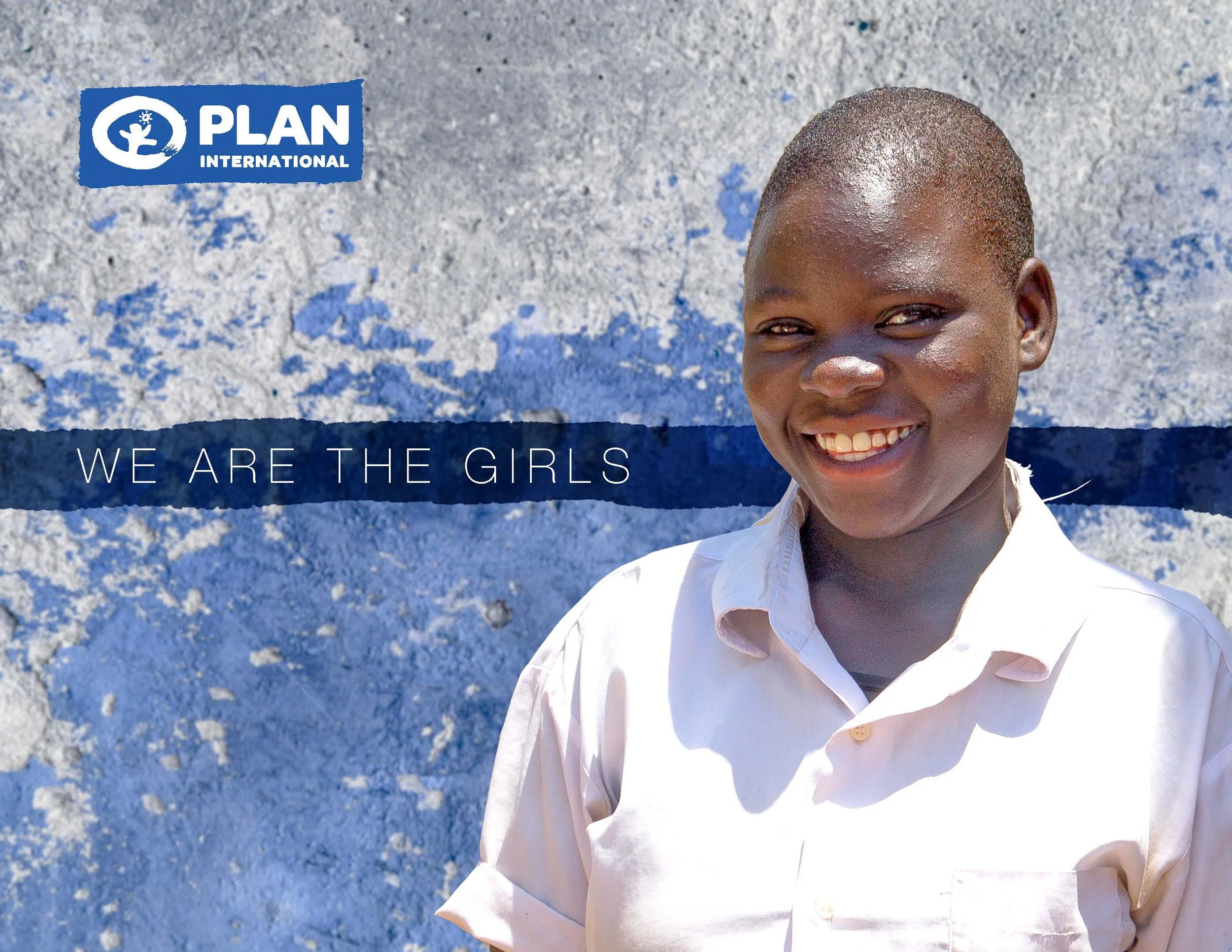
We Are the Girls Capital Campaign
for Plan International USA
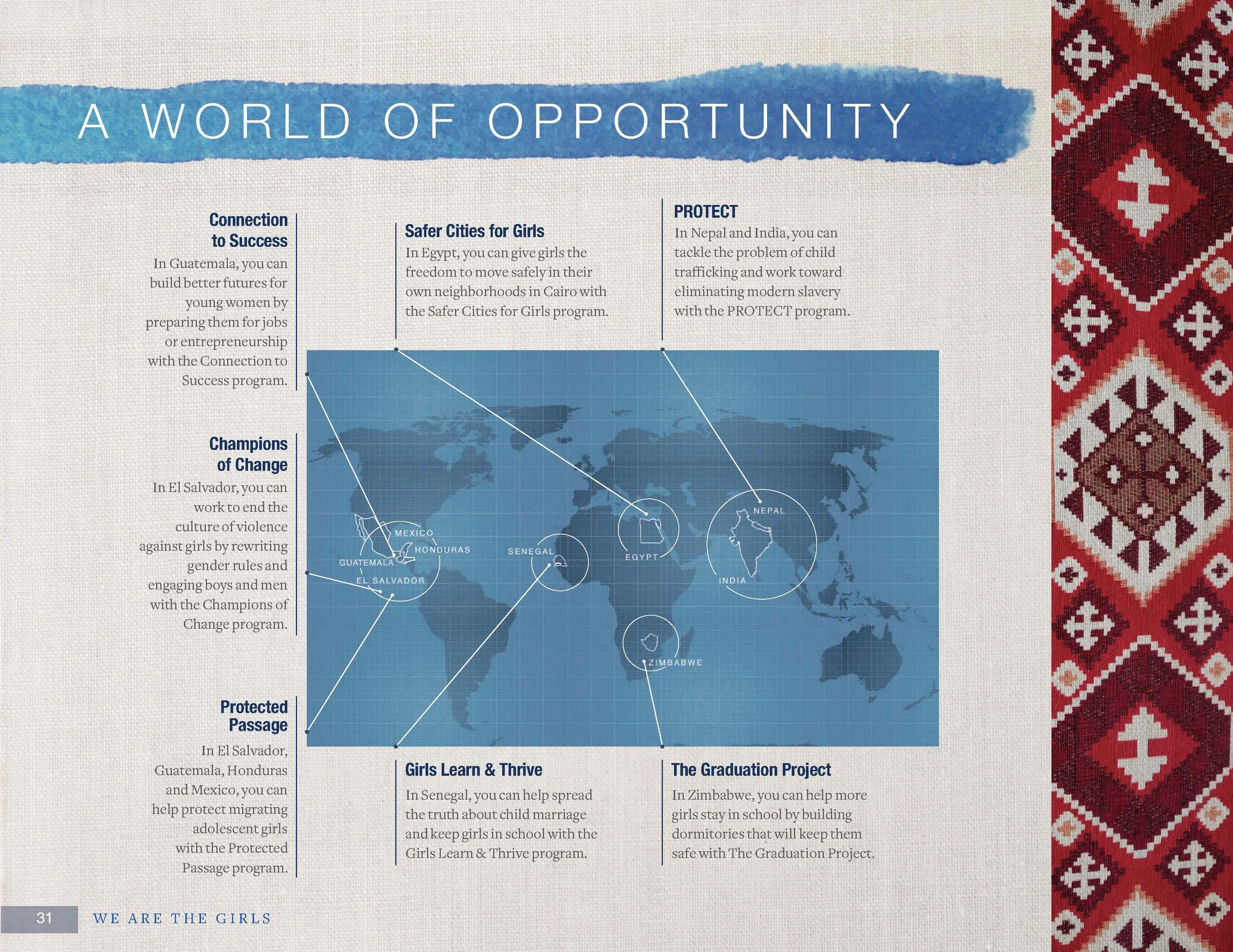
Plan USA is a girls’ rights organization that launched a capital campaign called We Are the Girls to raise funds to support gender equality and girls’ rights around the world for girls in low income countries.
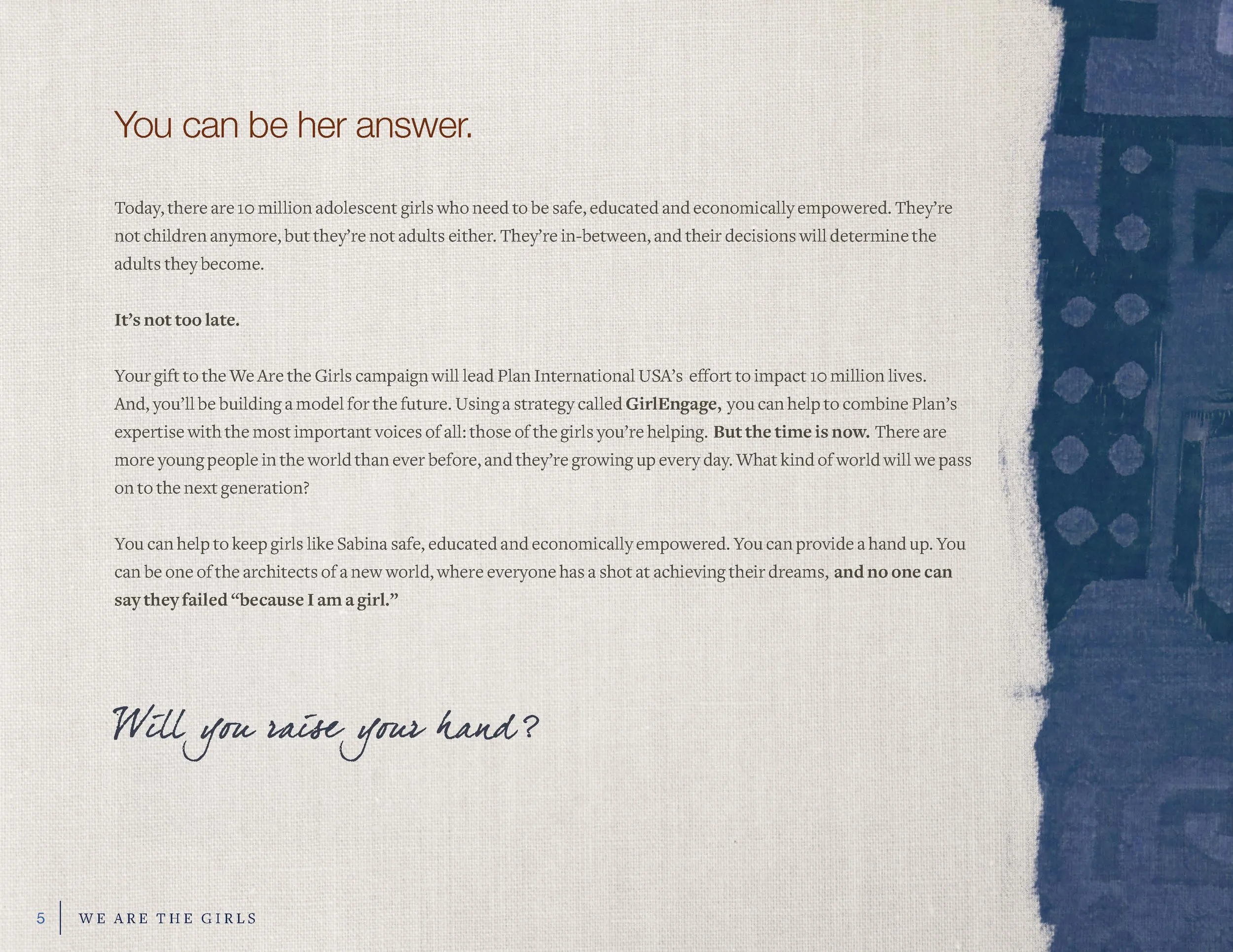
The Need
For the launch of their first major capital campaign in recent history, the organization needed a full branding package, including identity, art direction, messaging and visual assets to support a $200 million fundraising ambition. The branding for this franchise would need to be memorable, persuasive, aligned with the primary brand, and resonate intellectually and aesthetically with high-net-worth individuals.
The Solution
As the creative director, I worked closely with the in-house writers and designers to deliver a distinctive brand package, including a name that was rich in storytelling potential, and highlighted the organization’s unique and inclusive approach for working for and with girls.
Working closely with the writing team, we developed concise and impactful messaging that articulated the need, the case for support, the organization’s unique differentiators, the potential for supporters to create both immediate and generational impact, and key first-person narratives that would emotionally engage the audience.
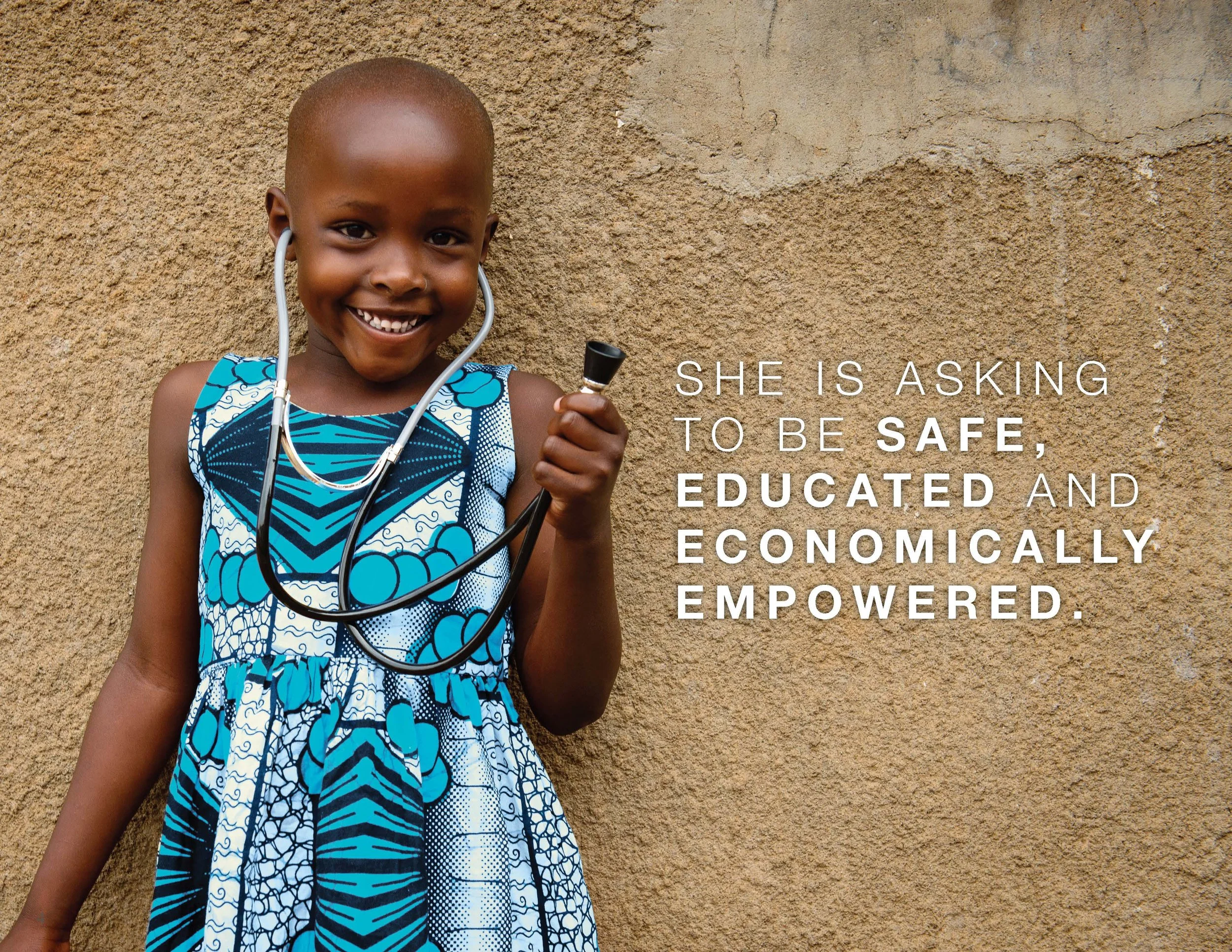
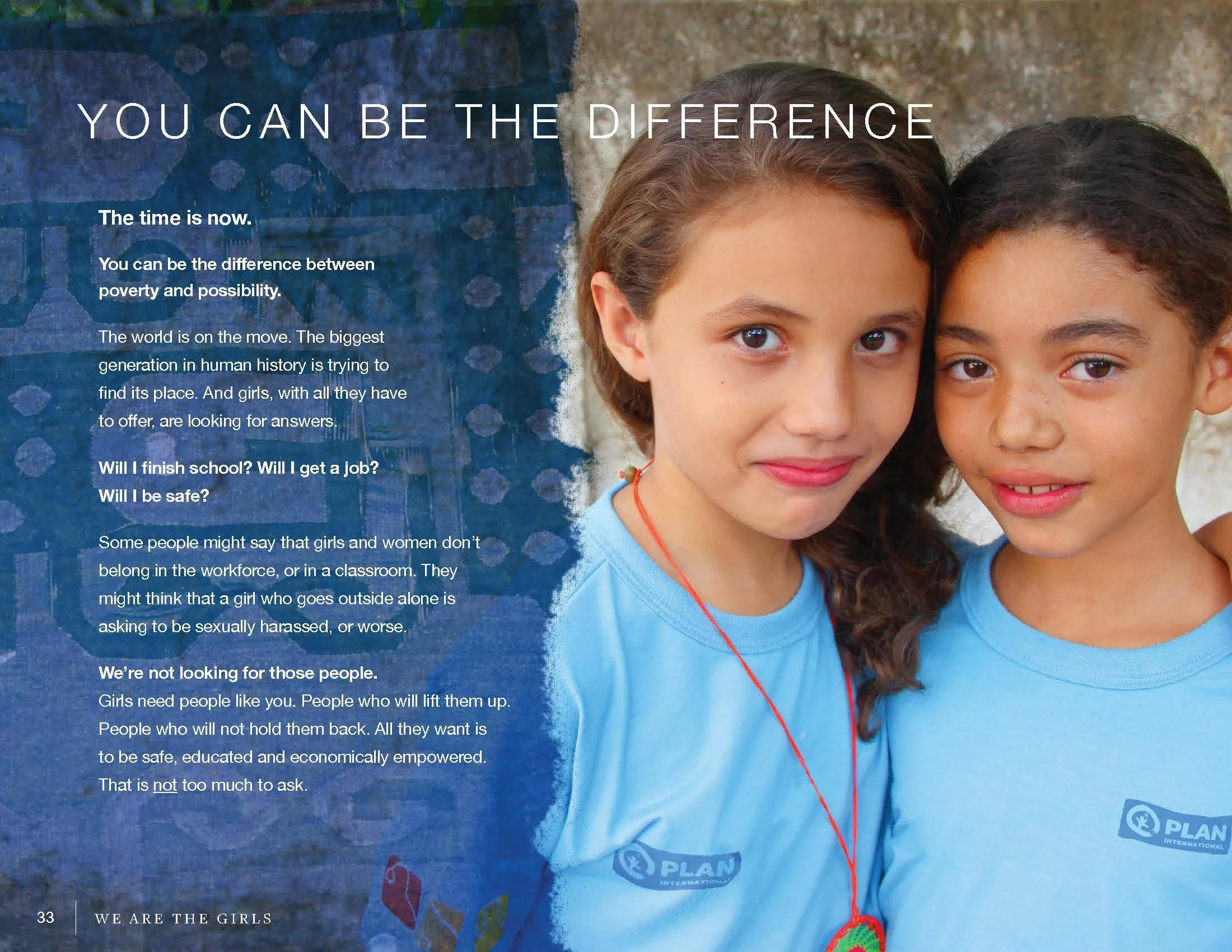
While Plan’s primary brand reflects the needs of the mass-market, this campaign would initially target high-net-worth individuals, which was reflected in the aesthetic decisions made for the campaign’s art direction. Rich textures and watercolor paint strokes were used to invoke the human elements of the campaign’s mission, and samples of hand-made textiles form around the world alluded to the international nature of the cause. These visual elements, along with a subdued palette and a sophisticated hand-writing style typeface created an overall visual language that spoke effectively to the target audience.

-
Campaign naming
Key messaging and content strategy, including content acquisition
Visual branding and art direction
Campaign and program videos
Prospecting marketing materials
Stewardship materials
Program proposals and reports
-
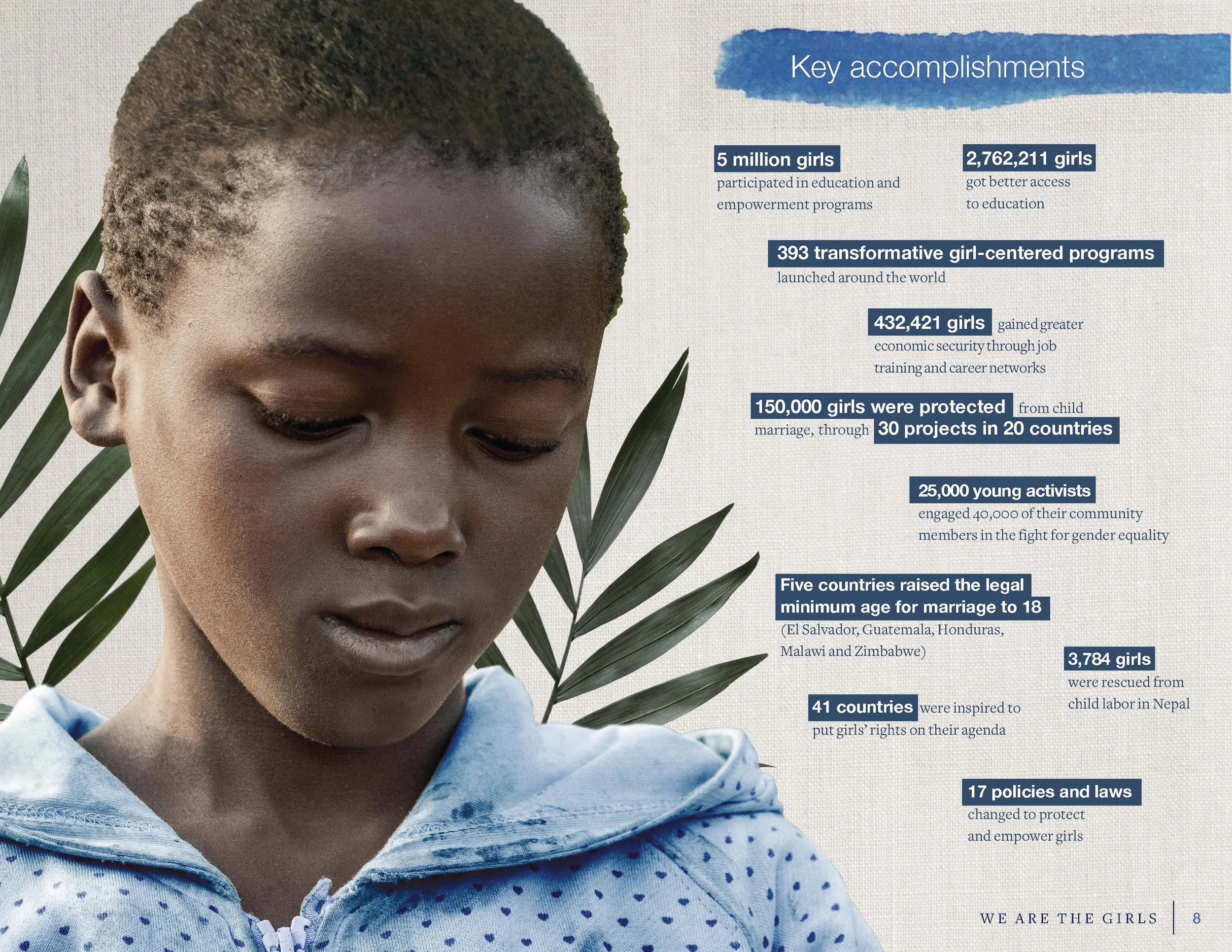
The WATG campaign was an enormous success in building partnerships, increasing awareness and is forecasted to overreach its revenue goal by 15%.
The campaign garnered organic influencer engagement, a partnership with UnSplash which challenged feminine representation in stock photography and search, and reenforced the organization’s unwavering commitment to girls. -
“Time and again, we receive compliments from donors and volunteers on the beautiful We Are the Girls campaign materials. The Vision Book is the most visually stunning piece Plan has produced in the 10+ years of my tenure and it makes an immediate impact on the recipient.
The Creative team took the initiative to create a bespoke aesthetic for all campaign-related materials — from the proposals and budgets to the report backs and newsletters. This attention to detail elevates our brand. It is a pleasure sharing the materials with our all of our donors — from individuals to corporations and foundations.”